Sanofi Pasteur
Swiftwater, PA
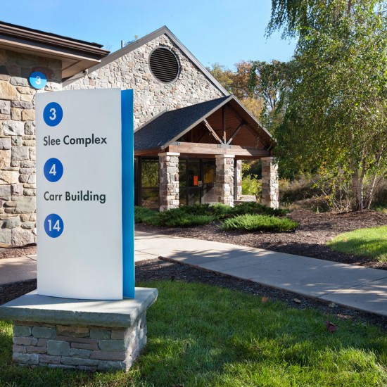
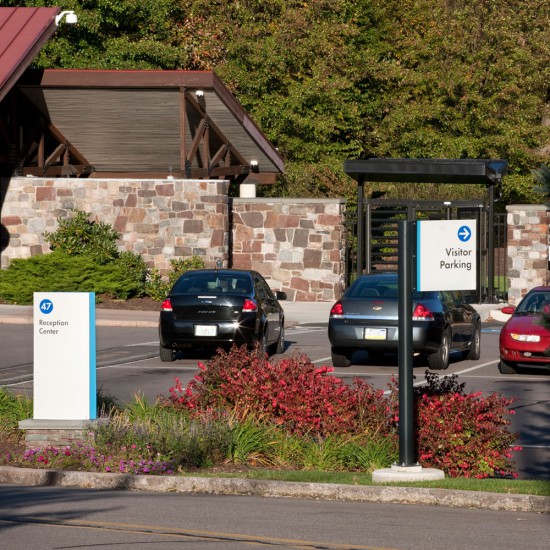
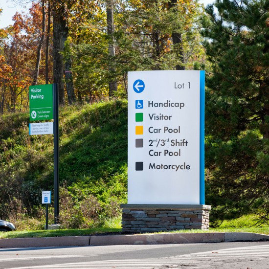
Spread out over 150 acres, the comprehensive signage program reinforces Sanofi’s brand identity through the use of its logotype and corporate colors. The fieldstone sign bases reinforce the rural, rustic setting and the curved sign faces provide an urbane counterpoint. We dubbed the design style country corporate.


